3D Flip Card Effect with CSS

In this tutorial we will create flip card on hover revealing the post excerpt on the back of the card. We will achieve this effect using HTML and CSS.
CodePen:
Key Parts:
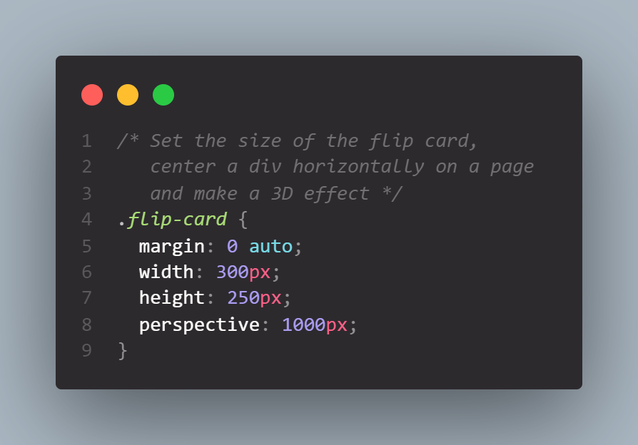
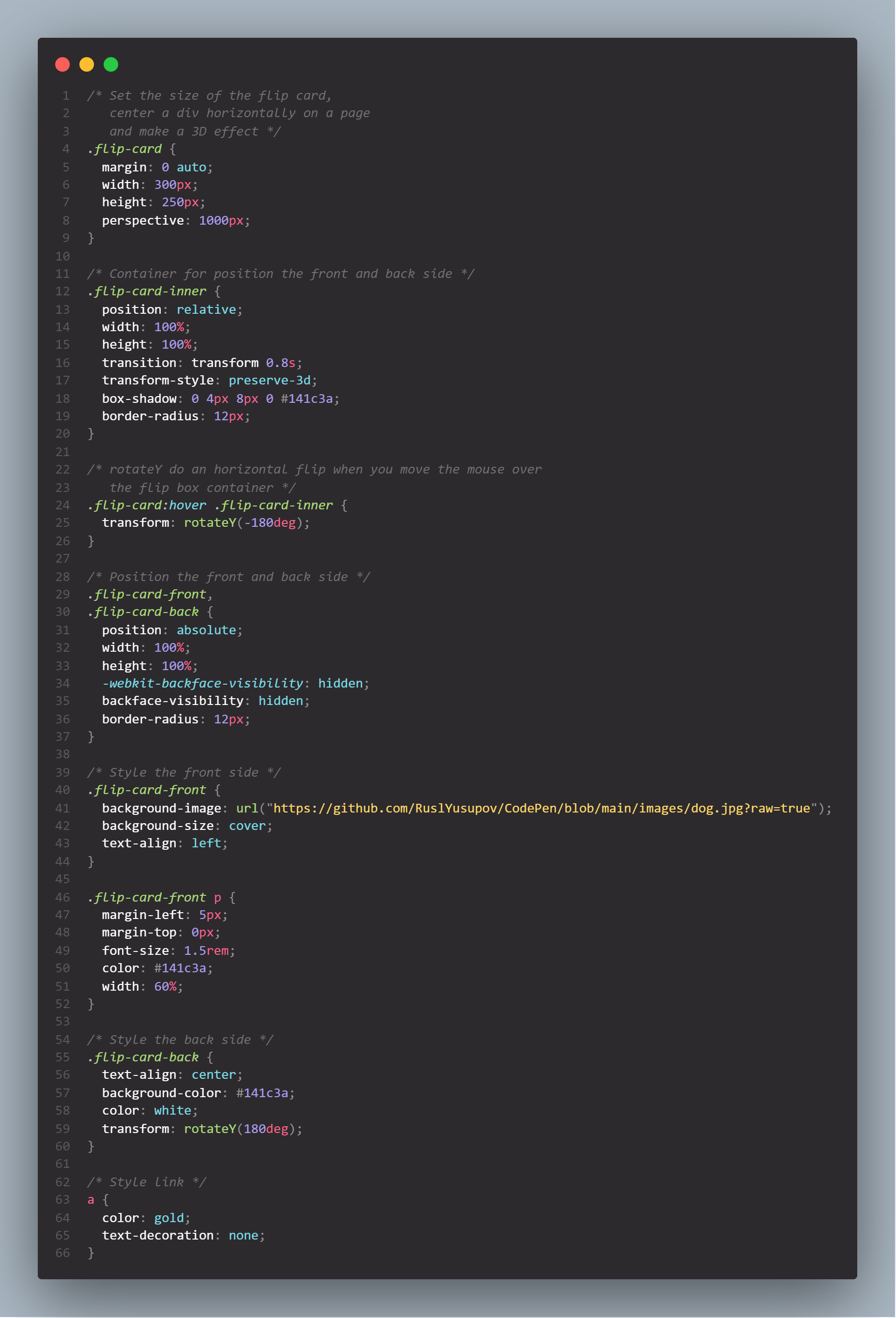
The card flip effect happens when the element is rotated 180 degrees along the Y-axis. To create the 3D effect, we need a 3D space for that element by adding perspective to its parent:
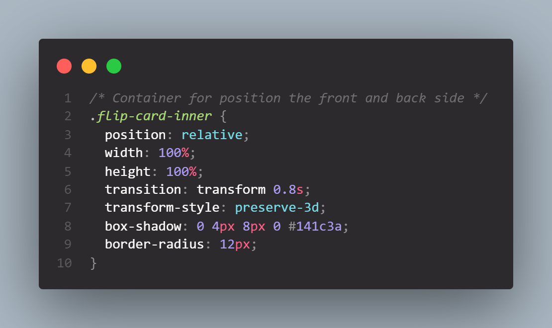
Add the most important properties required for these – the transition and transform-style properties:
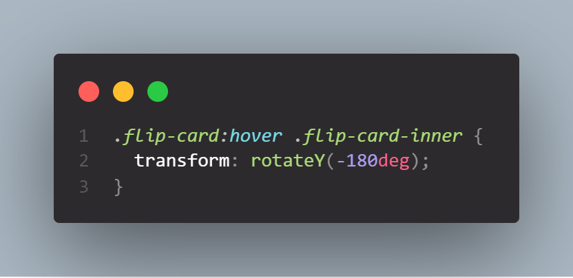
Now we can only see the front face. We need to rotate 180 degrees on the Y axis the post div when the parent is hovered:
We don’t want the back of the element to appear. For that, we use backface-visibility: hidden;
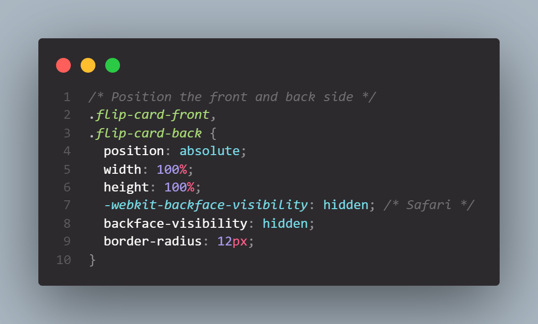
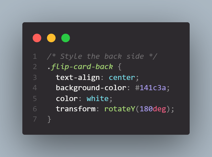
Both of sides placed one on top of the other. But we need the back face to be facing backwards – which means, it needs to be rotated 180 degrees on the Y axis:
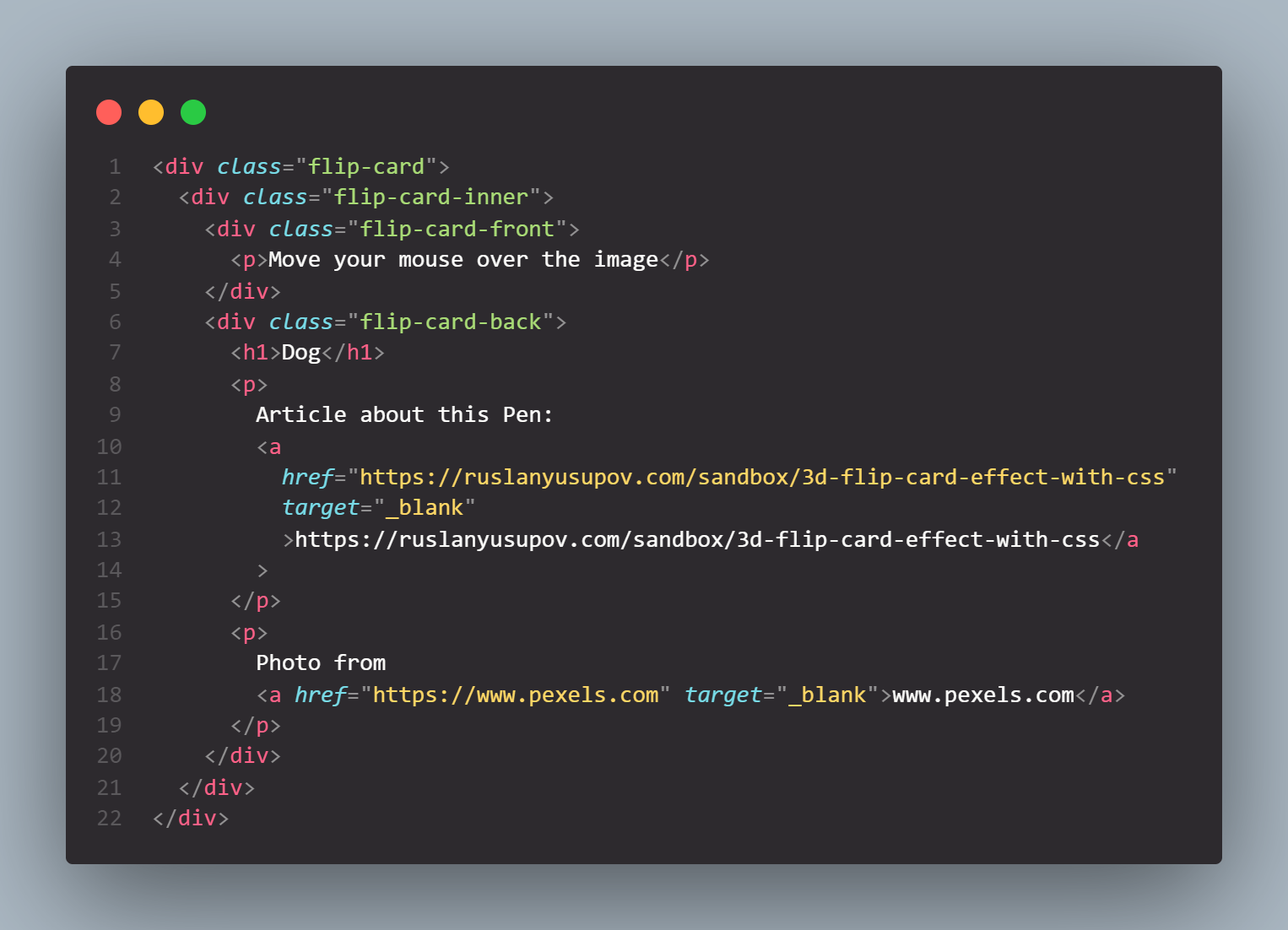
Full Code:
HTML:
CSS:
The end result is responsive, making the card flip on click, on mobile devices.