Media Queries Breakpoints In 2021
Aug 29, 2021 · 3 min read
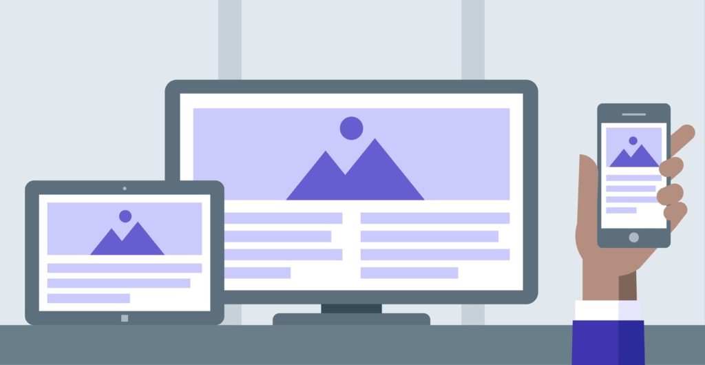
A major part of responsive design is creating the right experience for the right device. Media queries breakpoints playing the main role in responsive design.
This list сontains many media queries that can be used to target designs for many popular and standard devices. That’s probably not generally a great practice, but it is helpful to know what the dimensions for all these devices are in a CSS context.
Widescreen devices
@media (min-width:2500px) - breakpoint for more flexibility
@media (min-width:1920px) - 1080p displays
@media (min-width:1760px) - breakpoint for more flexibility
@media (min-width:1680px) - 13″ MacBook Pro (1.5x scaling)
Desktops
@media (min-width:1600px) - breakpoint for more flexibility
@media (min-width:1536px) - Nexus 9
Laptops
@media (min-width:1440px) - 13″ MacBook Pro (2x scaling)
@media (min-width:1366px) - HD laptops (768p), iPad Pro 12″ (landscape)
@media (min-width:1280px) - Galaxy Tab 2 (landscape), Galaxy Tab S (landscape)
@media (min-width:1200px) – Laptops
Tablets
@media (min-width:1112px) - iPad Pro 10″
@media (min-width:1024px) – iPad Pro 12″ (portrait), iPad Air (landscape), iPad Mini (landscape), iPad Pro 9″ (landscape)
@media (min-width: 992px) - breakpoint for more flexibility
@media (min-width:834px) – iPhone XS (landscape), iPhone XR (landscape), iPad Pro 10″ (portrait)
@media (min-width:812px) - iPhone X (landscape)
@media (min-width:800px) - Galaxy Tab 2 (portrait), Galaxy Tab S (portrait), Kindle Fire HD 7
@media (min-width:768px) – iPad, iPad Air (portrait), iPad Mini (portrait), iPad Pro 9 ″ (portrait), iPhone 8 Plus (landscape)
@media (min-width:736px) – iPhone 8 Plus (landscape)
@media (min-width:667px) - iPhone 6/7/8 (landscape)
@media (min-width:601px) - Nexus 7 (portrait)
Mobiles
@media (min-width:568px) – iPhone SE (landscape)
@media (min-width:540px) - Surface Duo
@media (min-width:480px) - Windows Phone
@media (min-width:428px) - iPhone 12 Pro Max
@media (min-width:414px) - iPhone 11, iPhone 6/7/8 Plus, Pixel 2, Pixel 2 XL
@media (min-width:390px) - iPhone 12 and iPhone 12 Pro
@media (min-width:375px) – iPhone 12 Mini, iPhone XS, iPhone 6/7/8, Google Pixel
@media (min-width:360px) – Galaxy S5, Moto G4
@media (min-width:320px) - iPhone 5, iPhone SE
@media (min-width:280px) - Galaxy Fold
Smart Watches
@media (min-width:224px) - Apple Watch Series 5 (portrait)
@media (min-width:218px) - Moto 360 Watch
@media (min-width:197px) - Apple Watch Series 6 (portrait)
@media (min-width:184px) - Apple Watch Series 5 (landscape)
@media (min-width:162px) - Apple Watch Series 6 (landscape)